


The Big Idea
A robust consumer
Stephen Stanley | July 17, 2026
This material is a Marketing Communication and does not constitute Independent Investment Research.
Consumer spending has held up remarkably well this year as households have powered through higher energy prices, saving less than before to sustain other spending under the assumption that the energy spike will fade. The latest Federal Reserve update on household balance sheets covering the first quarter suggests the aggregate household balance sheet remains unusually robust. And more up-to-date intelligence on the consumer suggests the prevailing gloomy media narrative is inaccurate.
Debt loads are light
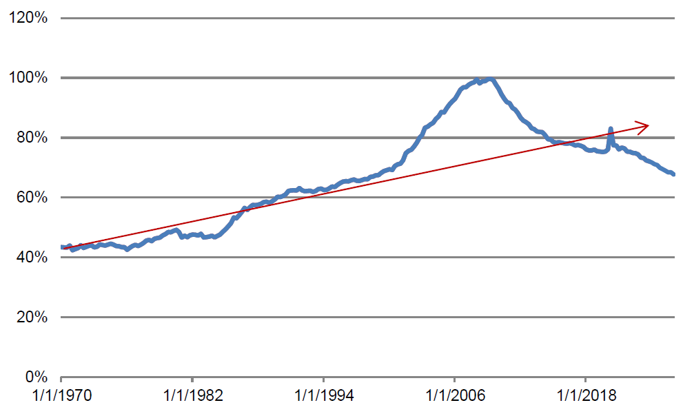
When assessing the health of the consumer, the best place to start is the overall level of household debt. As a percentage of GDP, household debt leveled off in Q4 of last year after falling for 17 straight quarters but resumed its descent in the first quarter of 2026. It sits at the lowest level since 1999, as seen in Exhibit 1. The series has fallen well below the trend line established from 1970 through 2000.
Exhibit 1: Household debt-to-GDP ratio
Source: BEA, Federal Reserve.
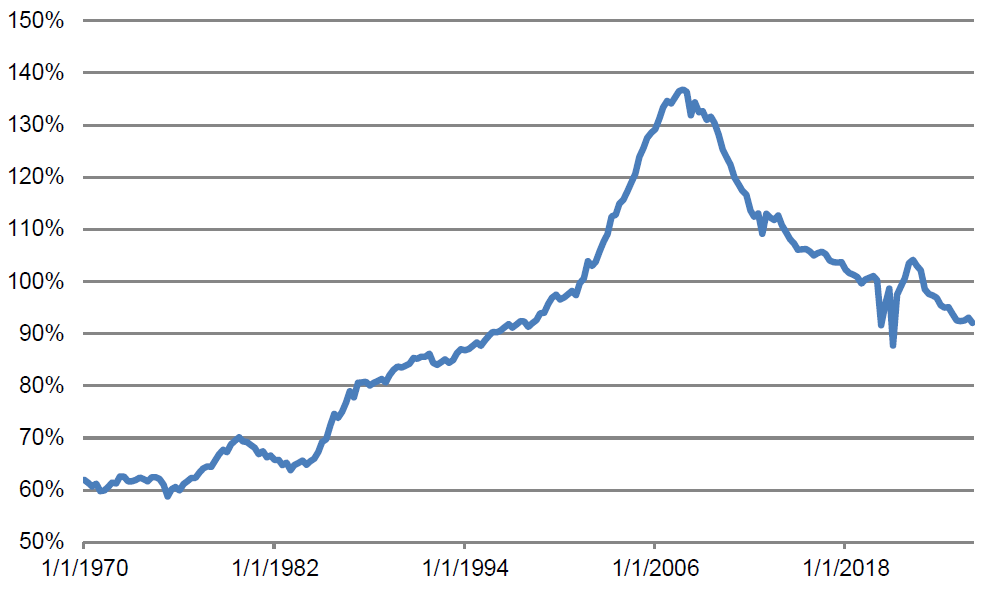
A similar way to assess the scale of household debt is to compare it to disposable income. This ratio inched up slightly in the second half of last year but plunged anew in the first quarter (Exhibit 2). And, aside from a couple of distorted readings during the pandemic, is at its lowest levels since 1998.
Exhibit 2: Household debt-to-disposable income ratio
Source: BEA, Federal Reserve.
The bottom line is that, while some individual households may be struggling with debt, households in the aggregate have extraordinarily light debt relative to the size of the economy or to their income, the lowest in a quarter-century.
Debt service burden
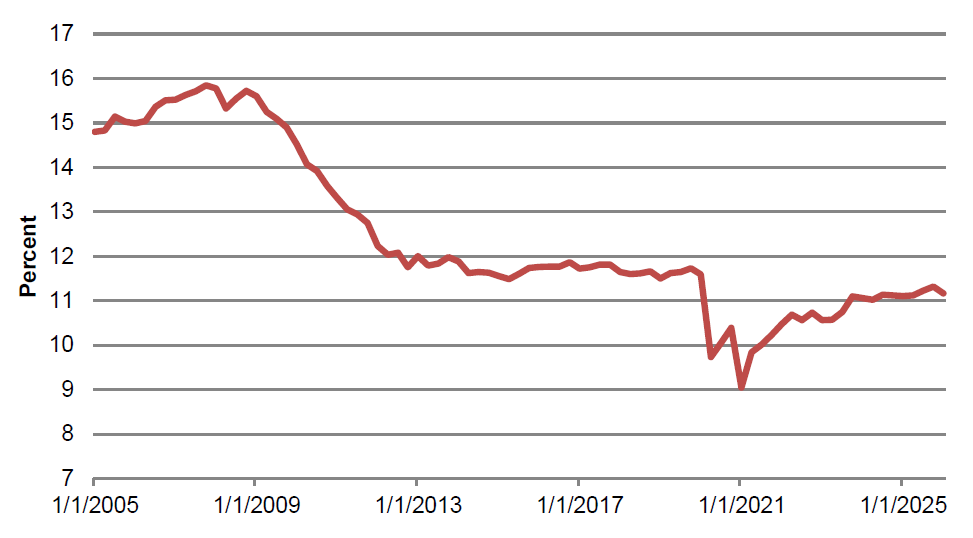
In a separate report, the Federal Reserve publishes estimates of the debt service burden, defined as the percentage of disposable income needed to stay current on debt payments. With interest rates up sharply since early 2022, one might imagine that even for a constant level of debt, the servicing burden of that borrowing would have risen substantially. However, the Fed data show that the debt service burden remains slightly below 2019 levels at 11.2% in the first quarter compared to 11.5% to 11.7% in 2019. In fact, the measure is currently lower than at any time before the pandemic (going back to 2005) and is little changed over the past year (Exhibit 3).
This is a testament to the prevalence of fixed-rate debt held by households, most notably for mortgages. However, it is more than that. Even the debt service burden for consumer credit sat at 5.3% in the first quarter compared to 5.7% to 5.8% in 2019. Given that this component includes auto loans, student loans, and the required payments on credit cards, it should be far more sensitive to higher interest rates than the mortgage component. And yet, though it has risen modestly from its post-Covid lows, when, by the way, student loans were in a government-imposed payment moratorium, it has not even returned to pre-Cd levels much less increased above that range, even as borrowing rates are far higher than in the late 2010s.
Exhibit 3: Debt service burden
Source: Federal Reserve.
Household assets
The Fed’s latest Financial Accounts data show that the value of household assets was little changed in the first quarter at $204.6 trillion. For all of 2025, household assets surged by almost $14 trillion, or over 7%. Household net worth was similarly roughly flat in the first quarter after surging by $13 trillion last year.
Tying household balance sheets back to consumer spending, there is an important point to be made. Higher interest rates have made it more difficult for households to liquify their soaring asset values. In the 2000s, at the drop of a hat, homeowners could execute a cash-out refinancing when their home values shot up. With mortgage rates so much higher than before and during the pandemic, this is not a desirable option for most mortgage holders.
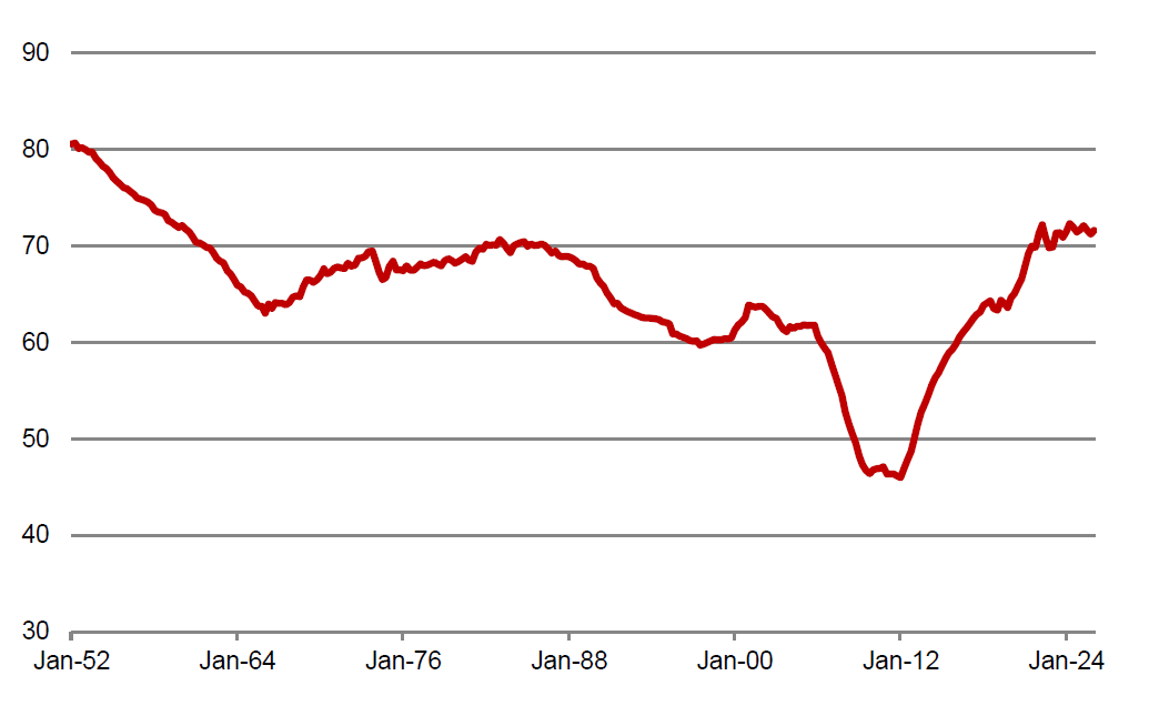
One indication of this dynamic is a measure that the Fed reports on in the Financial Accounts each quarter: owners’ equity as a percentage of real estate values. Over the past three years, this measure has hovered between 71% and 73%, the highest readings since the late 1950s. During the 2000s, even as home prices were soaring, homeowners were tapping their equity so fast that their ownership stake was actually falling (Exhibit 4). In contrast, the gauge has jumped by almost eight percentage points since the end of 2019.
Exhibit 4: Owners’ equity as a percentage of real estate values
Source: Federal Reserve.
While balance sheets are historically strong, the marginal impact of rising net worth on consumer spending, what economists call the “wealth effect,” has likely been far more limited than it might have been under a different interest rate profile.
Household liquid assets
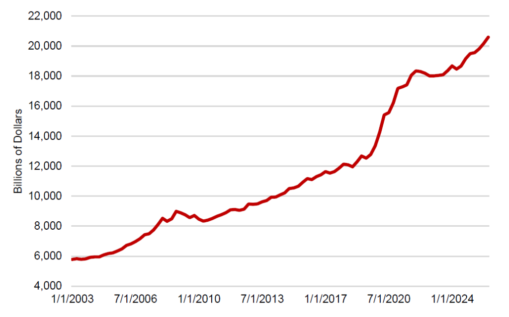
Given the windfall that households received from the federal government during the pandemic, I have closely tracked in recent years the evolution of household liquid assets. This series covers the portion of the balance sheet that represents cash equivalents and includes currency, bank deposits, and money market fund shares. I have emphasized this measure is a proxy for spendable funds.
Household liquid assets spiked during the pandemic, reflecting in large part the unprecedented waves of federal government largesse. Most economists presumed that consumers would spend down those balances quickly once the economy fully reopened. However, liquid assets have remained elevated by historical standards (Exhibit 5). Indeed, after ascending by over $1 trillion in 2025, this aggregate rose by another $400 billion in the first quarter of this year.
Exhibit 5: Household liquid assets
Source: Federal Reserve.
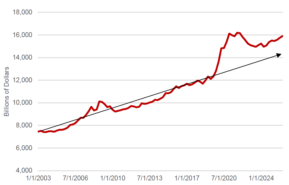
To be fair, a significant portion of the increase in spending power represented by these liquid assets has been eroded by inflation. The level of prices, as measured by the PCE deflator, has risen by almost 25% since the end of 2019. Real household liquid assets, using the PCE deflator as the price index, have come off their peak (Exhibit 6).
Exhibit 6: Real household liquid assets
Source: Federal Reserve.
The exhibit shows that the series was most of the way back to the trend line by the middle of 2023. After that, real liquid assets resumed growth, suggesting that households viewed their cash positions as back to “normal” (presumably, if they were sitting on elevated liquidity that they intended to spend, the series would have continued to decline).
Over the past two years, however, the growth in real household liquid assets has once again outpaced the pre-pandemic trend. As of the end of 2025, the level of this measure, at $16.0 trillion, sat about $1 trillion, or 7%, higher than if the trend rate of growth seen over the decade prior to the pandemic had continued going forward from the end of 2019.
Thus, while, as usual, the main driver of consumer spending going forward is likely to be the pace of income growth, household balance sheets continue to indicate that consumers have plenty of spending power available to them.
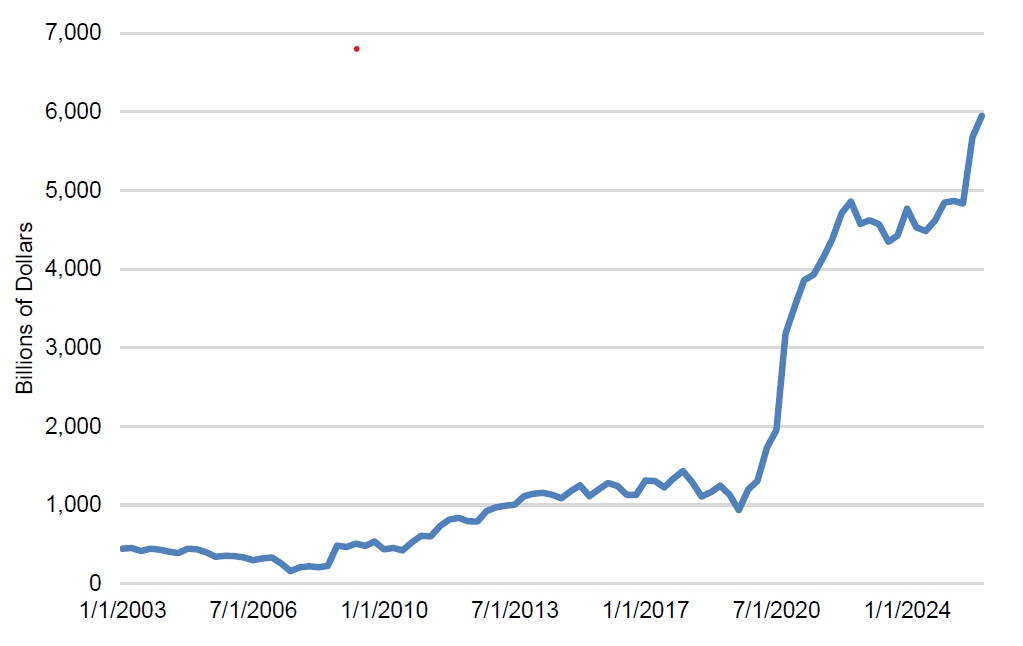
The more detailed breakdown of the liquid assets data further underscores the improvement in household spending power. Over the past two quarters, households’ holdings of currency and demand deposits exploded, rising by well over $1 trillion in just six months (Exhibit 7). This surge came mainly at the expense of savings and time deposits, which fell by over $700 billion over the same time span. It is not entirely clear why households executed such a dramatic shift in the composition of their liquidity holdings, but, at the margin, more money in cash and checking accounts and less in saving accounts and CDs seems likely to be supportive of spending going forward.
Exhibit 7: Household checkable deposits and currency
Source: Federal Reserve.
More recent soundings
The prevailing narrative in the popular media with regard to the consumer remains the so-called K-shaped economy. While there is some truth to the argument that many households at the lower end of the income scale are struggling, the aggregate state of household finances appears to be thriving and, if anything, improving in recent quarters.
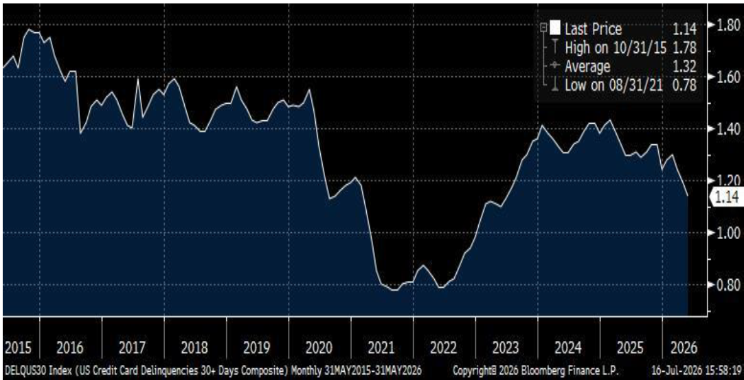
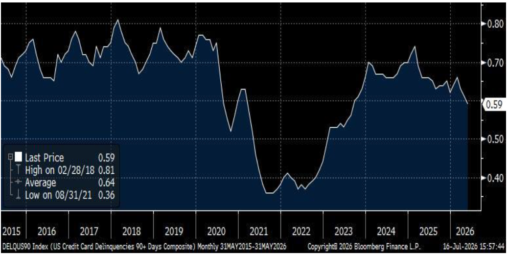
Analysts frequently cite credit card delinquencies as evidence of financial stress. However, a careful examination of the credit card payment data supports the positive story from the aggregate Federal Reserve data laid out above. It is useful to look at 30+-day and 90+-day credit card delinquencies for a group of servicers including Amex, Bank of America, Capital One, Chase, Citibank, and Discover (the numbers are compiled by Bloomberg) through May (Exhibit 8, 9). Both 30- and 90-day credit card delinquencies peaked in early 2025 and have fallen noticeably since, with particularly steep declines in recent months, when households were supposed to be under the greatest financial stress due to the jump in energy prices. Both series have moved well below pre-pandemic ranges.
Exhibit 8: 30+-day credit card delinquencies
Source: Bloomberg.
Exhibit 9: 90+-day credit card delinquencies
Source: Bloomberg.
The recent second quarter earnings releases of major US banks corroborate the card delinquency figures. The Wall Street Journal noted on Tuesday: “Loan balances on cards were up at JPMorgan, Bank of America, Citigroup, and Wells but delinquency rates for credit cards were largely down compared with a year ago. JPMorgan executives dismissed the idea of a so-called K-shaped economy, pointing to continued spending and low loan delinquencies across income segments. Bank executives noted the labor market had remained healthy and was key to consumer health.”
The latest monthly data from the Bank of America Institute also pour cold water on the “K-shaped economy” narrative. For a number of months, data from BoA customers showed that take-home pay gains for lower-income households were lagging those of middle- and higher-income families and that this widening gap translated into the card spending of Bank of America customers. However, the gaps have closed in recent months, as the lowest third of households by income saw the year-over-year advance in their after-tax pay surge from less than 1% at the end of last year to 4.1% in June, roughly on par with the increase for the top third and better than the middle third. Similarly, the gap in year-over-year spending growth between lower-income households and everyone else had gotten remarkably wide in the second half of last year but largely closed by June. BoA Institute economists offered two possible explanations. First, households with modest income may be benefiting most in 2026 from lower tax withholdings that stem from the tax changes in last year’s fiscal legislation. Second, Institute economists also point to a noticeable increase recently in the rate of job switching and note that job switchers in lower-income positions are seeing especially large pay hikes when they change jobs. This speaks to a broadly stronger labor market, a development which would be expected to benefit everyone but particularly those in lower-income echelons.
Conclusion
The state of household finances is not perfect, but the latest aggregate data from the Fed confirm that, overall, balance sheets remain quite robust. At a time when worries about the consumer ratcheted up due to higher energy prices, it looks like a firming in labor demand may be providing a timely boost to household finances.